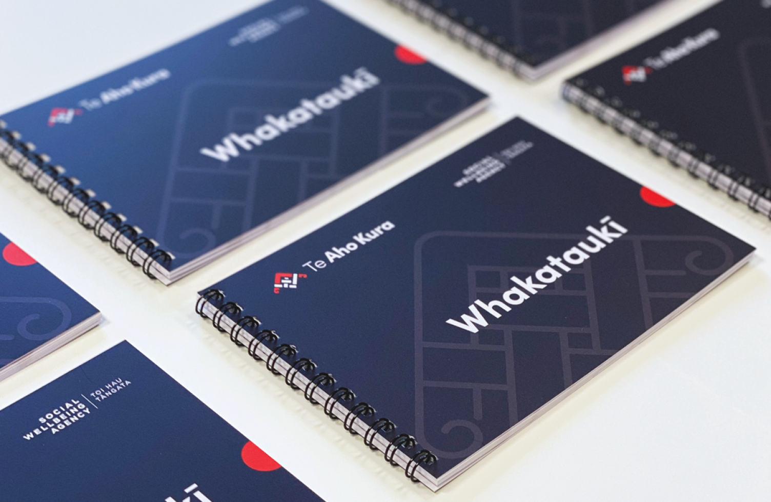
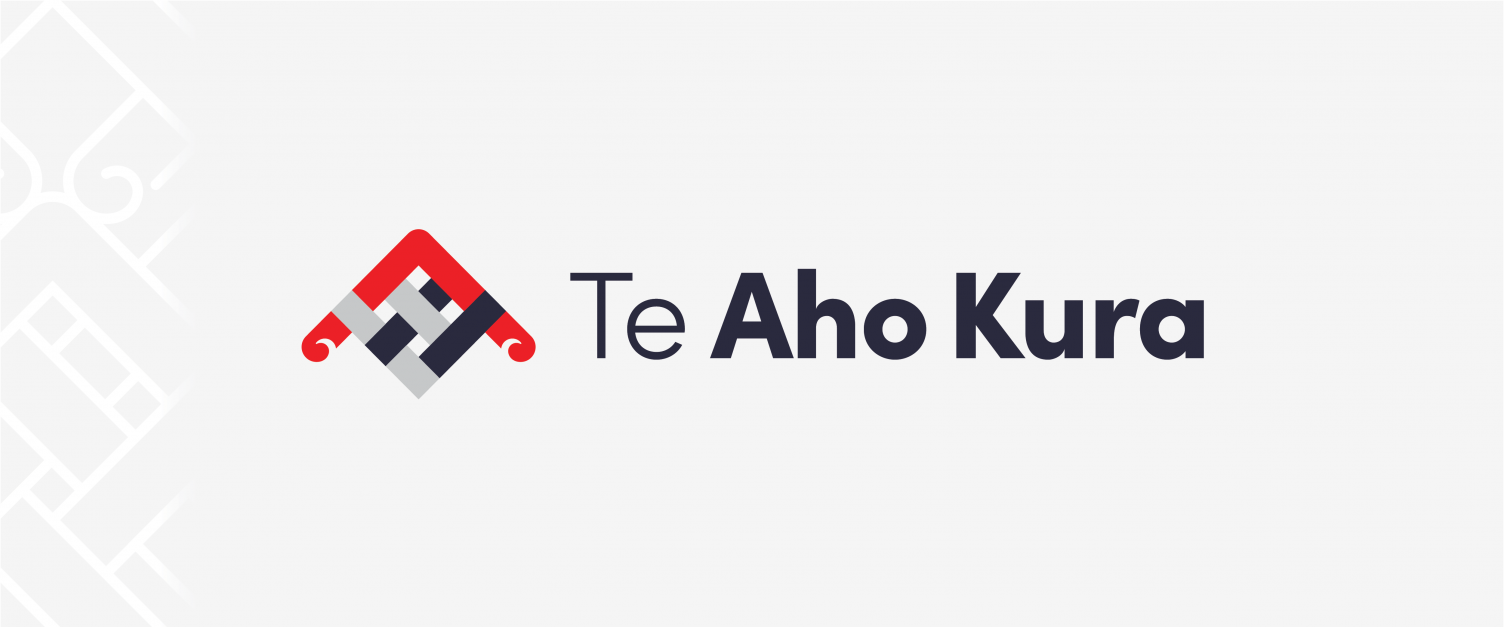
The Social Wellbeing Agency Toi Hau Tāngata works on challenging social-sector problems to improve people’s lives. They focus on making the greatest impact on policy issues that affect the wellbeing of New Zealanders. When The Social Wellbeing Agency (SWA) decided to revamp their brand, they commissioned us to develop an identity for their cultural capability programme, Te Aho Kura – The Red Thread.
We worked on
- Brand identity
- Print & digital design

We worked alongside Uekaha Douglas, the Māori advisor at SWA, to develop a brand story and rationale for the programme that ultimately fed into the design and visuals.
The word Aho is one translation for thread, but it is also has a deeper meaning which talks about the descent line. In a way, it talks about our whakapapa as a country and through learning and bringing light to our past, only then we can move forward – and that is a big part of what Te Aho Kura aims to do.
The word Kura is another word for red, which is considered to be the colour of Rangatira. In the whakatauakī or proverb – the black thread represents Māori, the white thread represents Pākehā, and the red thread represents Rangatira – so it is the red thread that would bring everyone together.
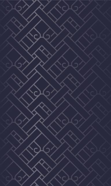
Staying true to the brand’s original intention outlined in the brand story, the new mark features a woven motif reminiscent of traditional Māori design but is modernised with rounded koru and shapes. The logo mark embodies the idea of bringing people together under one authority, and the subtle design choices of rounded edges and elevated mark echos Te Aho Kura’s positive and people centred approach to the programme.