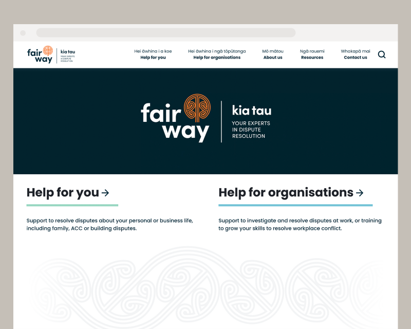
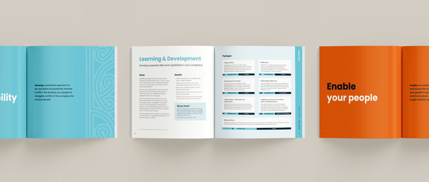
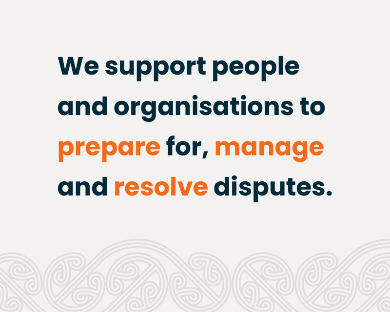
Our brief was to reposition and redesign the Fair Way brand to demonstrate their capability and diversity in the dispute resolution industry. The rebrand was used to navigate a transformation of Fair Way’s identity through a complete overhaul of design and assets, embodying their commitment to service, culture and collaborative process. The rebrand had to ensure it met the needs of the business, their clients, and future aspirations.
We worked on
- Brand strategy
- Motion graphics
- Brand identity
- Print & digital design
The new brand we were tasked to design needed to feel progressive and dynamic, and most of all stand out in the now-crowded dispute resolution services industry.
Our aspiration was to centre the brand around Te Ao Māori values, and have them reflected in the process and organisation itself. We facilitated two workshops (lead by Atawhai Tibble) as a preamble for the brand refresh, and continuing cultural work at Fair Way.
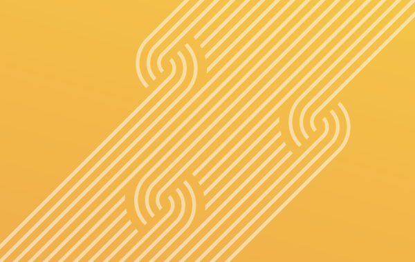
We chose to design a mark inspired by a mangōpare element which features heavily as a symbol of strength, determination, and leadership in Māori design.
In toi whakairo (Māori art of carving) the repetition of three lines (haehae) represents the three elements that makes up a journey: past, present and future. The clients’ past issues bring them to Fair Way for resolution in the present, and together they can move forward to a peaceful future.